Project
My Mind Check
Brand identity
Mental health can be a tough subject for anybody to broach, let alone for young people in a school environment. Many hold their cards close and as a result schools don’t always have an accurate view on the mental wellbeing of their students. After years of research, Macquarie University have developed a free digital mental health check-in tool for schools that gives students (K-12) a voice on a national scale, which is backed by the Australian government.
SomeOne were tasked to create the brand identity and as part of the project team, I had the privilege to be involved in the brand identity & rollout, copywriting, social templates, and art direction.
National School Wellbeing, Check

A recurring discussion early on around the tool being like a ‘pulse check’ helped springboard the idea, ‘express yourself’. An open invitation to show how you might be feeling without expectation or judgement. ‘Express yourself’ is positive yet welcomes all emotions and allows the brand world to lean into the good, the sad, and everything in between.
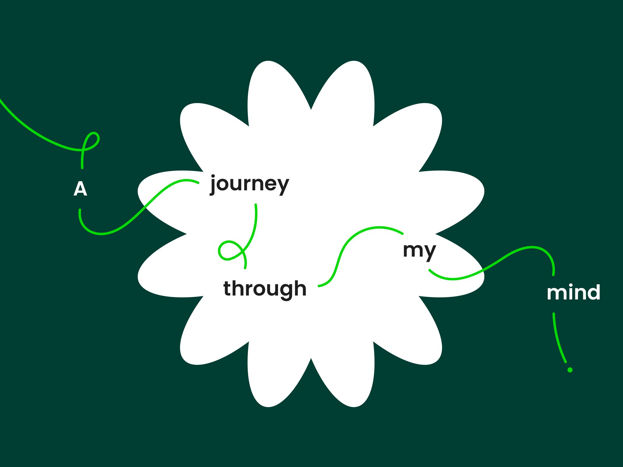
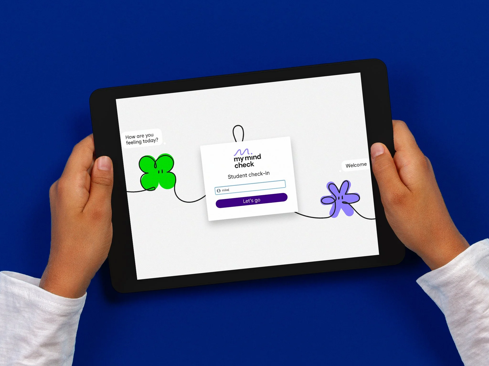
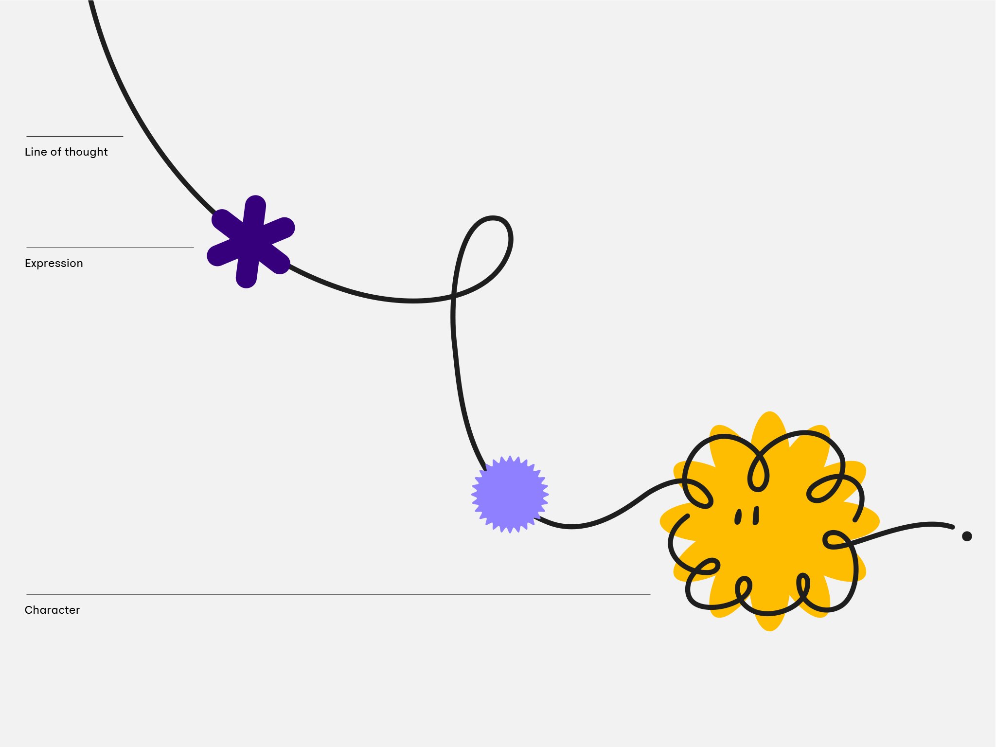
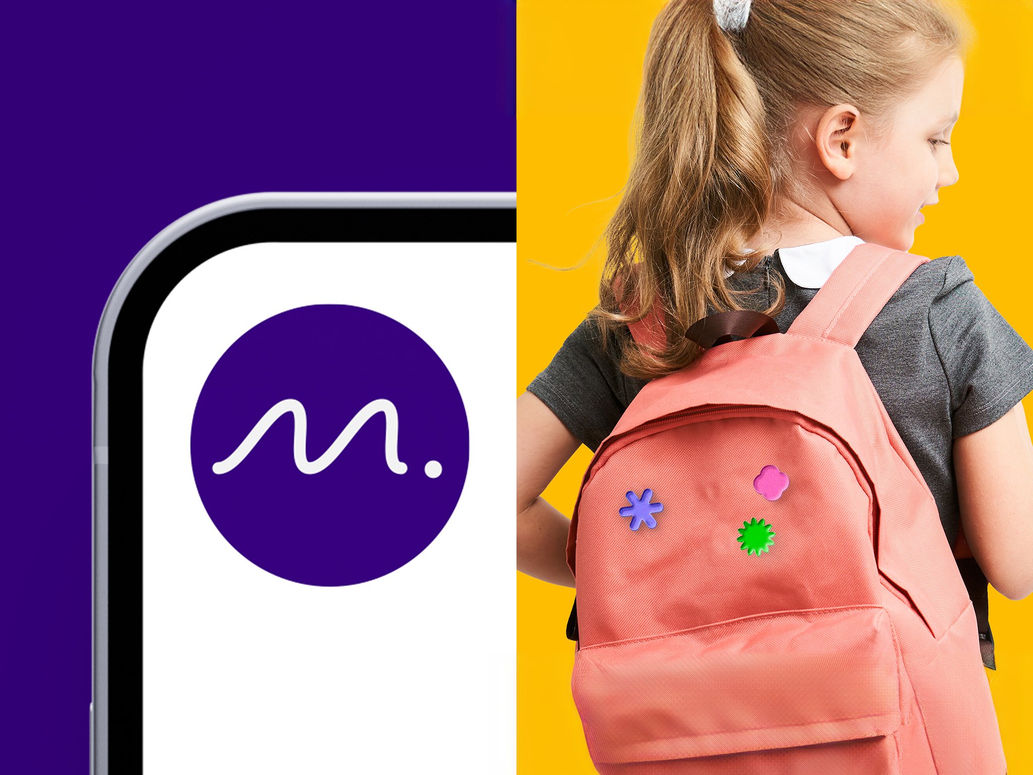
A challenge in creating the brand was balance. It needed to demonstrate who the tool is for (young people) while also being credible for parents and school wellbeing champions. The brand world begins and ends with the logo. A smile-in-the-mind take on the pulse check and a visual connection with the wider brand world theme of ever-flowing lines of thought. Designed to flow in any direction, the flexibility of the brand allows each ‘journey’ to be unique. At its most playful, the dynamic line shapes itself into a range of personalities, each capturing moments of thought, emotion and expression. Neutral enough to not stand for any one feeling but with enough character for open interpretation.
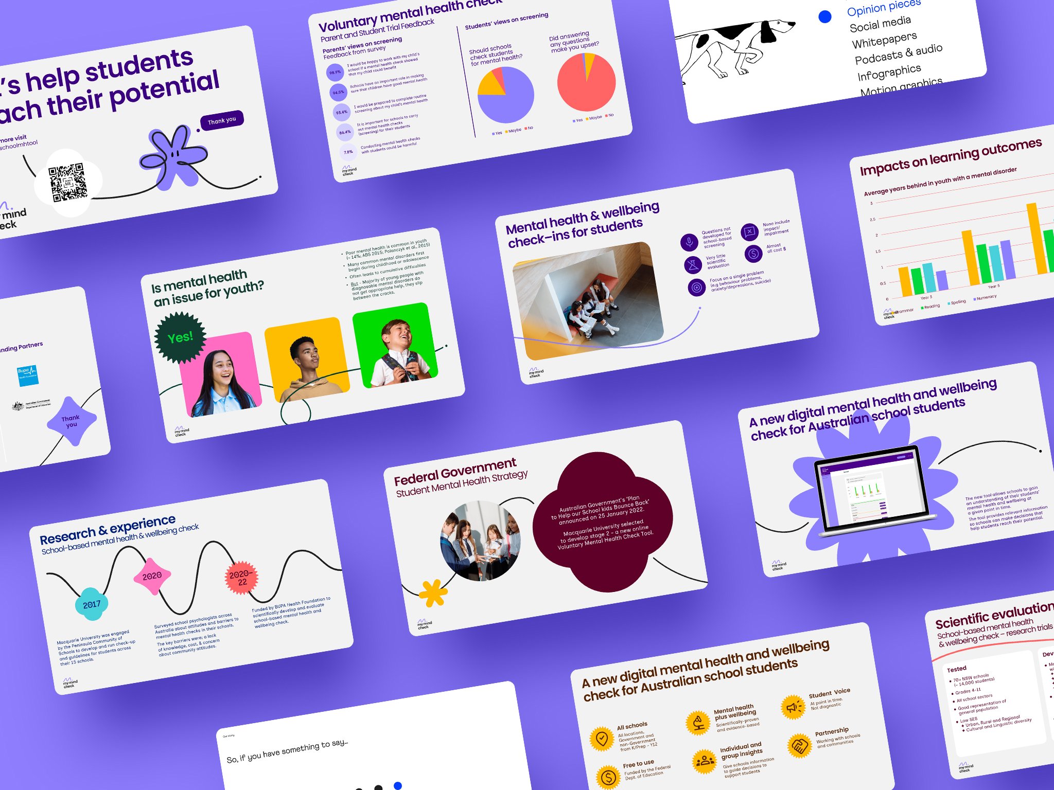
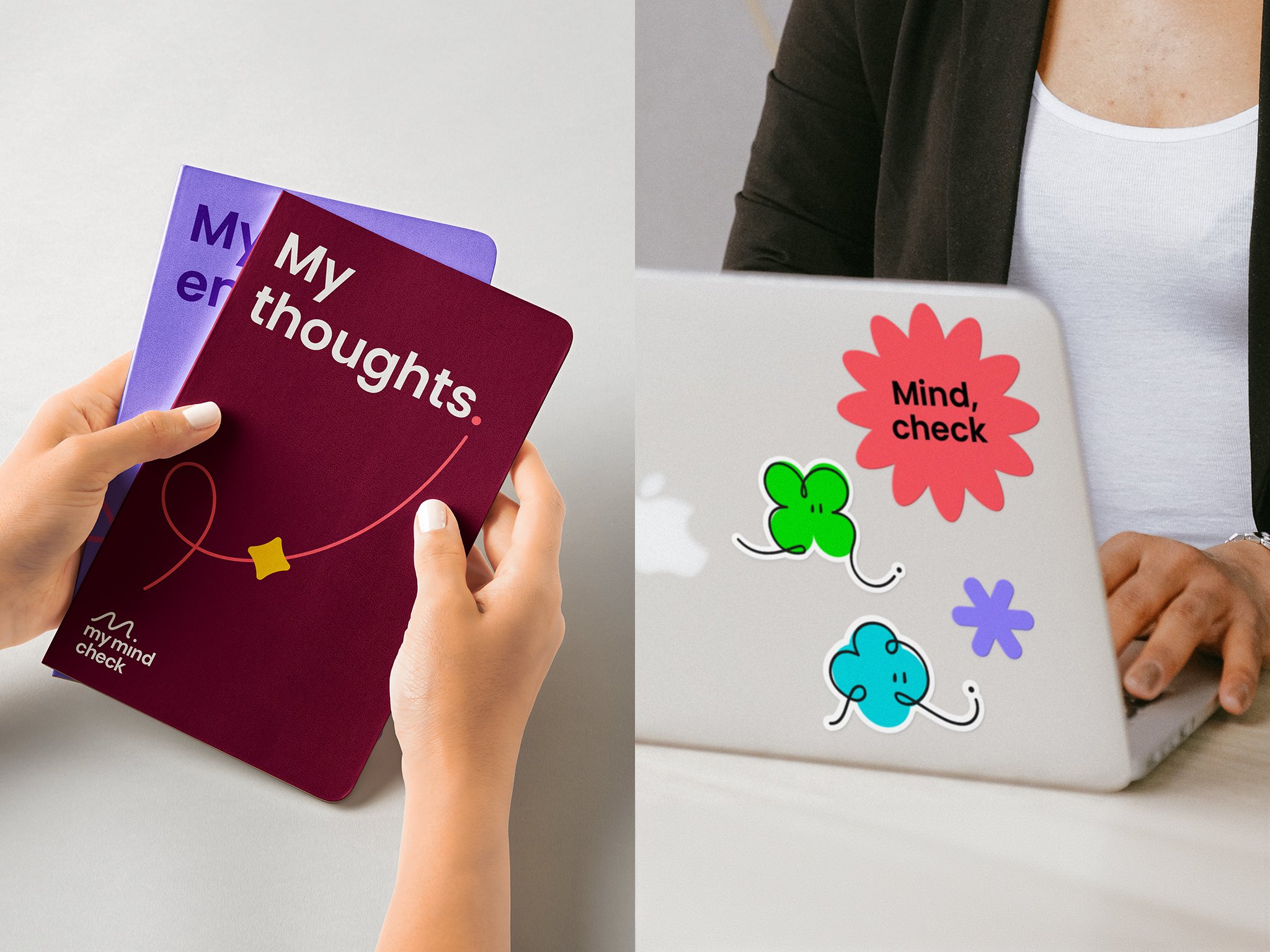

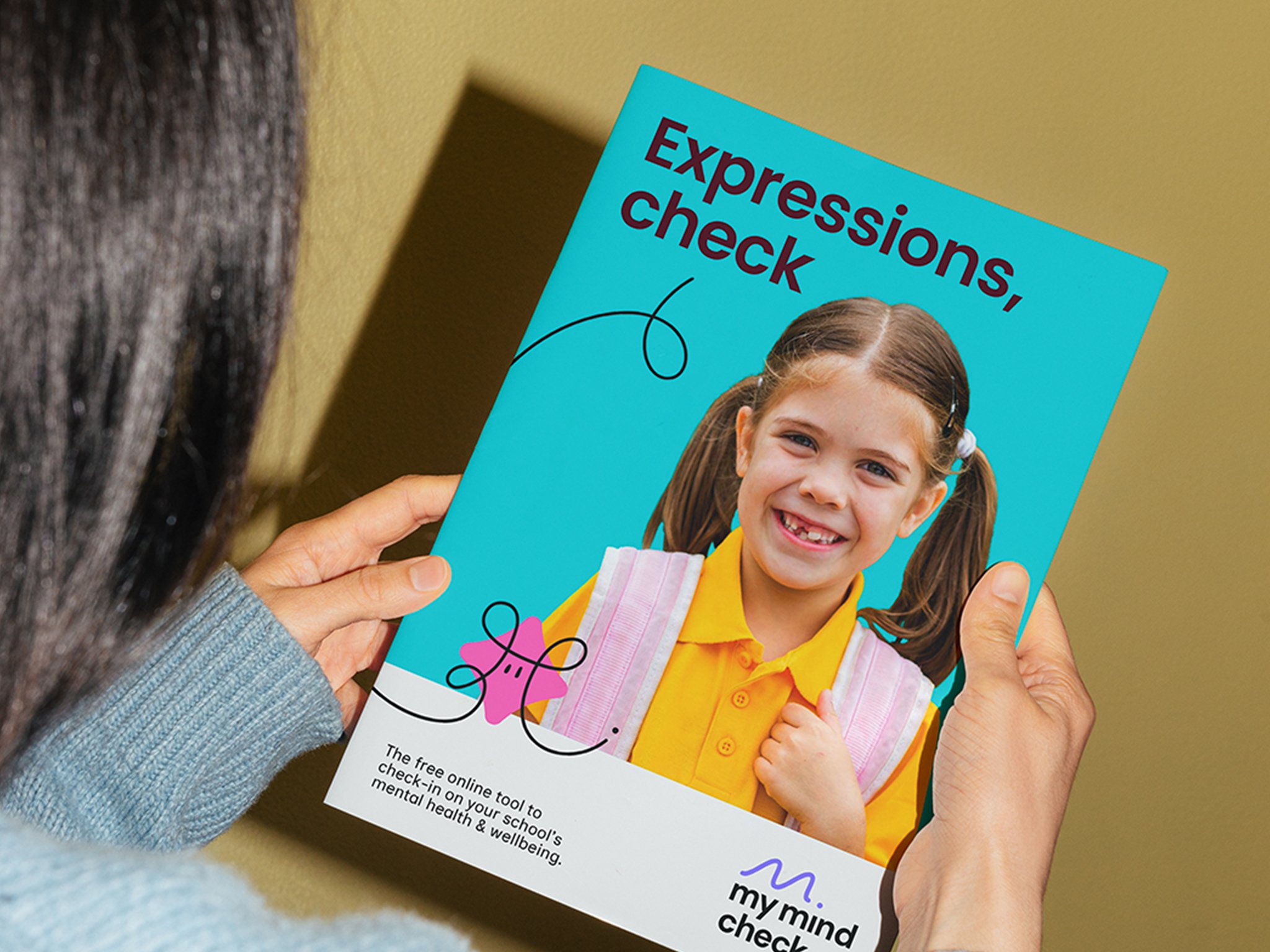
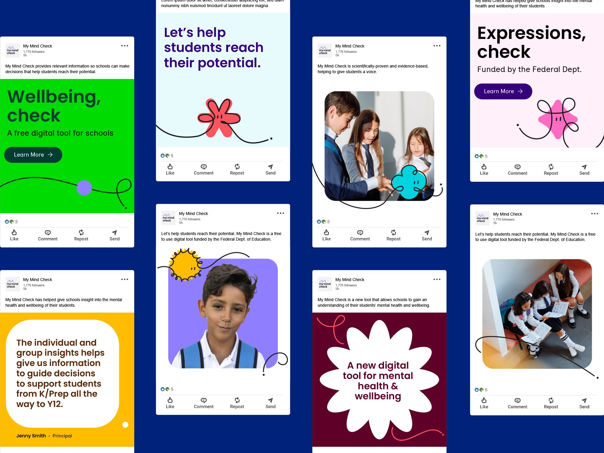
With accessibility a key requirement in the UI of the tool, we extended this across the brand with a high contrast colour palette that pairs bright & dark tones, and the pairing of two highly accessible open source type families, Poppins & Inclusive Sans — the latter of which is designed to be the most inclusive typeface on the market. Brand language riffs on the name, giving communications an idea to grasp onto even when graphics are minimal. Expressions, check. Feelings, check. Health, check.
Details
Project
Studio
SomeOne Sydney
Creative Team
Creative Direction — Tom Dabner
Client Services — Rebecca Bosustow
Design — Kate Hendry (Lead), Tom Dabner, Michelle Jin, Julien Bertouille
Motion — Tom Dabner
Website Build — Humaan