Project
Brand identity
Website design
See it live
Evoke
Evoke is an interior development company who manages projects from design to build, ensuring dreams align with delivery. They have a holistic approach to creating places where communities thrive, with every project encapsulating WELL principles — air quality, thermal comfort, environmental impact, and natural light.
SomeOne were brought on to help Evoke better articulate why they do what they do and the way they do it with a brand that fits this narrative and differentiates them from their competitors. My role as part of the SomeOne project team included: brand rollout & templates, brand guidelines, iconography, and website design.
Creators of well–places


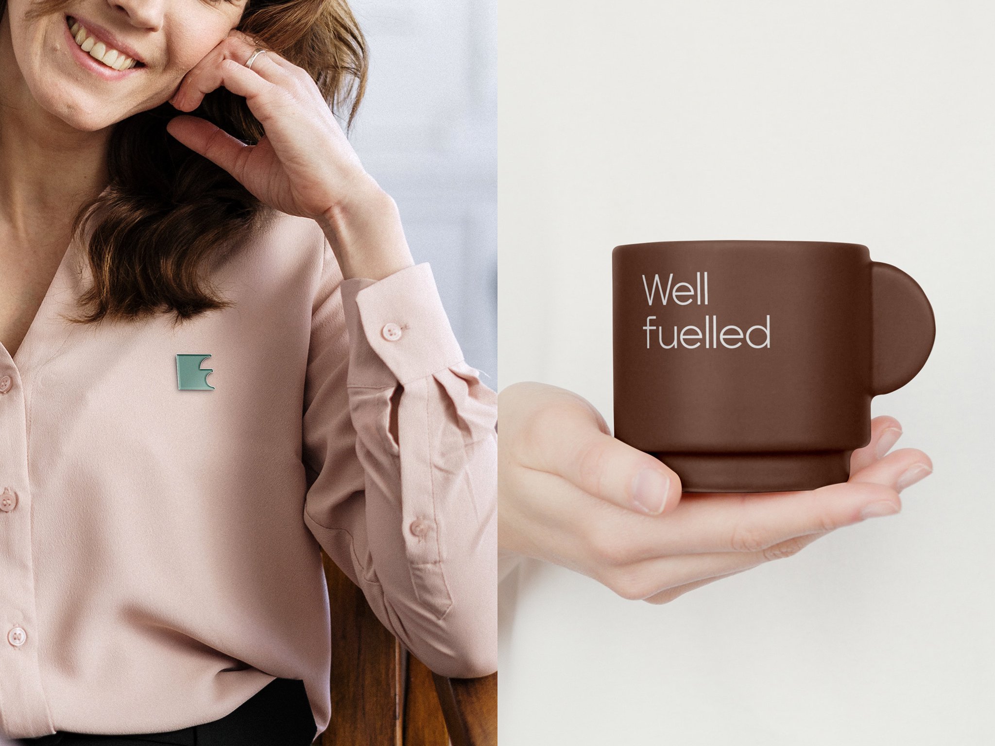
For Evoke, it’s not about the spaces they create, but about the places they become and the communities that are enabled to thrive in them. With this so ingrained in their practice, naturally this informed the brand idea. ‘Creators of Well–places™’. The logo is championed by a smile-in-the-mind symbol. An E crafted from a simple square with a variety of shifting apertures designed on first glance to reflect an abstract floorplan layout, and when inspected closer reveals in some instances a simple silhouette of a person, and in others a half smile.

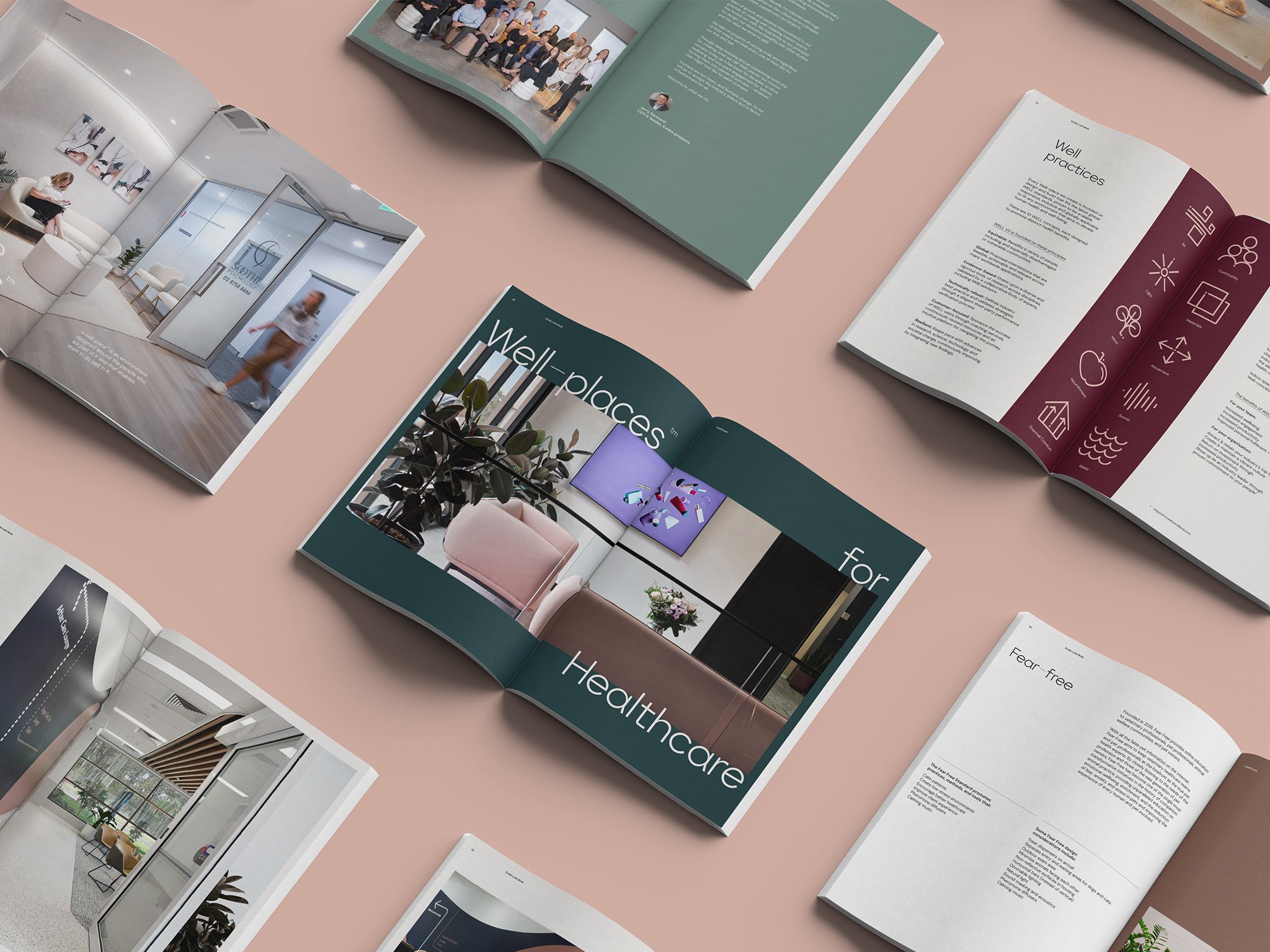
Each element of the design system works in harmony with the geometry of the logo; the typeface balances between hard angles and playful quirks; iconography visually expresses what makes a ‘well–place’, and is constructed to match the typeface; and the colour palette leans into calm, WELL inspired tones — brought to life in motion by motion artist, Ben Holden.


Details
Project
Studio
SomeOne Sydney
Creative Team
Creative Direction — Tom Dabner
Client Services — Rebecca Bosustow
Brand Strategy — Tom Dabner, Julien Bertouille
Design — Julien Bertouille (Lead), Michelle Jin, Tom Dabner
Motion — Ben Holden
Website Build — Andrew Cunneen